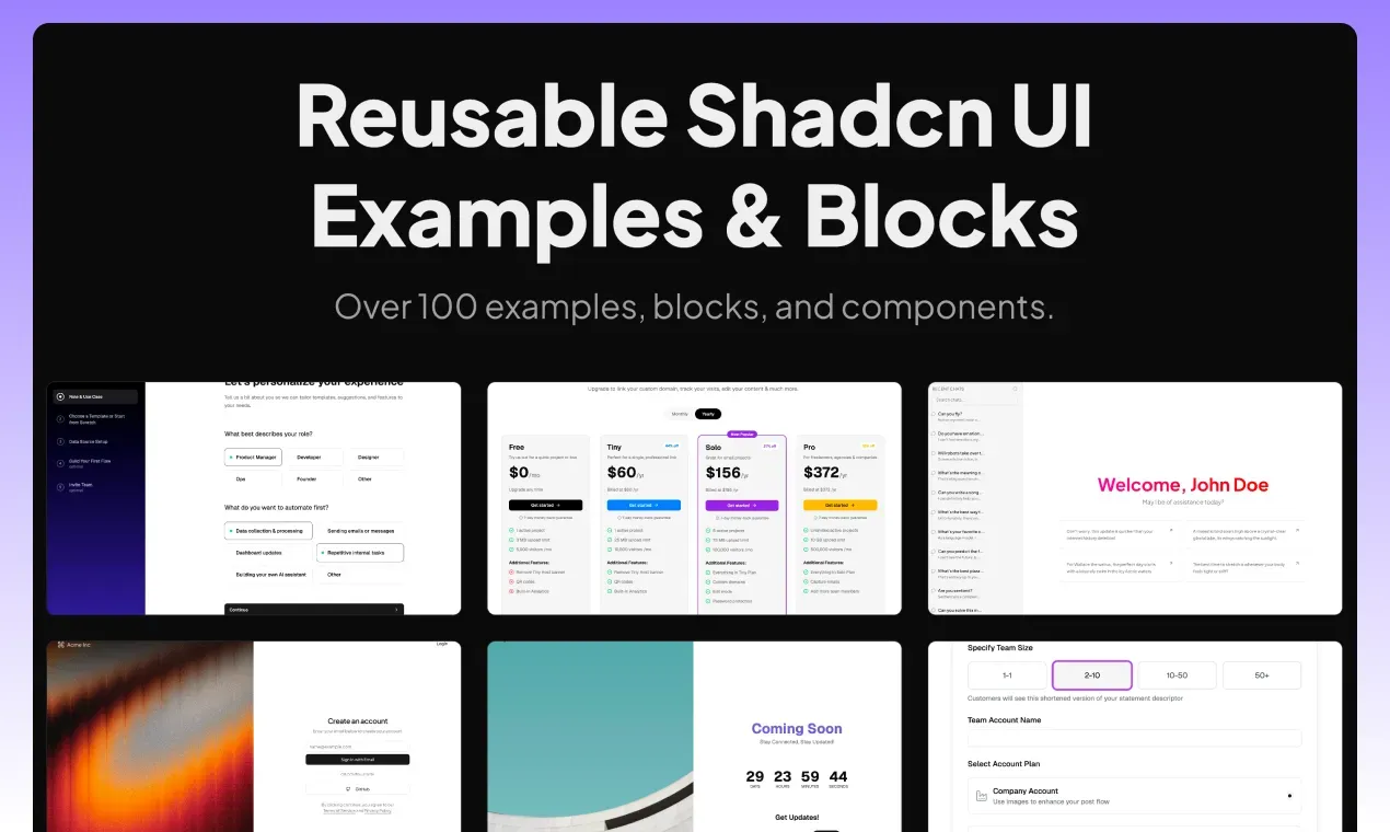
Shadcn Examples
Explore reusable Shadcn UI examples and blocks built with Tailwind CSS, React, and Next.js. Includes admin dashboards, e-commerce, and more.
Overview
Shadcn Examples is a comprehensive collection of reusable UI components, blocks, and templates built with shadcn/ui, Tailwind CSS, React, Next.js, Vue.js, and Svelte. The platform addresses the common challenge of finding high-quality, ready-to-use UI examples that are both customizable and consistent with modern design systems. It serves developers, designers, and teams who need to rapidly prototype or build production interfaces without starting from scratch. The library covers a wide range of categories including admin dashboards, e-commerce pages, marketing sections, and application layouts, all built with TypeScript and adhering to accessibility standards.
Key Features
-
Admin Dashboard Templates: The collection includes multiple admin dashboard examples such as website analytics dashboards, file manager apps, settings pages, roles and permissions pages, and notification pages. Each template is built with a clean, responsive layout and includes data visualization elements like charts and tables. The dashboards are designed to be easily customizable with Tailwind CSS utility classes.
-
E-Commerce Components: A full suite of e-commerce UI blocks is available, including add product forms, shopping carts, checkout pages, point of sale (POS) apps, pricing tables, product detail pages, and product lists. These components are built with form validation, responsive grids, and interactive elements like quantity selectors and payment forms.
-
Application Blocks: Beyond dashboards and e-commerce, the platform offers blocks for chat apps, music apps, social media apps, kanban boards, todo list apps, note apps, and AI chat interfaces. Each block is a complete page or section that can be dropped into a project.
-
Marketing and Landing Page Sections: The collection includes bento grids, blog pages, changelog pages, coming soon pages, contact pages, and pricing tables. These are designed to help marketers and founders quickly build landing pages with compelling layouts.
-
Multi-Framework Support: While primarily built with React and Next.js, the examples also support Vue.js and Svelte, making them accessible to a broader developer audience. All components are TypeScript compatible.
-
Open Source and Community Driven: The project is open source on GitHub, allowing developers to contribute, suggest improvements, or fork the repository. The website includes a "Make a Suggestion" link and social media channels for community engagement.
-
Search and Navigation: A command palette search feature allows users to quickly find specific blocks or examples. The site is organized by categories (Admin, E-Commerce, General) and includes a "Recently Added" section for new content.
How It Works
Users can browse the collection directly on the website without any signup. The homepage displays featured examples and recently added blocks with preview images and brief descriptions. Clicking on a block leads to a dedicated page with a live preview and code snippets. For full access to all examples and blocks, users can purchase a lifetime access plan via the pricing page. The open source nature means developers can also clone the GitHub repository and use the components locally. The command palette (triggered by a search button) enables quick navigation across the entire library.
Use Cases
- A solo founder building a B2B SaaS product can use the admin dashboard templates to quickly set up a professional-looking analytics interface without hiring a designer.
- A frontend developer at a digital agency can leverage the e-commerce components to rapidly prototype a client's online store, including product listings, cart, and checkout flows.
- A marketing team launching a new product can use the bento grid and pricing table blocks to create a visually appealing landing page that converts visitors.
- A startup building a chat application can start from the chat app template and customize it with their own branding and features.
- A freelance developer can use the open source repository to learn best practices for building with shadcn/ui and Tailwind CSS, and reuse the components across multiple projects.
Who It's For
Shadcn Examples is designed for frontend developers, full-stack developers, and designers who work with React, Next.js, Vue.js, or Svelte. It is particularly useful for those already using shadcn/ui and Tailwind CSS who need production-ready examples. The platform competes with other UI component libraries like Tailwind UI, Flowbite, and Preline, but differentiates itself by being open source, community-driven, and offering a broader range of complete page templates rather than just individual components. It is suitable for solo developers, small teams, and agencies looking to accelerate UI development.
Pros & Cons
The Good
- Comprehensive collection of ready-to-use UI blocks and templates for multiple frameworks.
- Open source with a community-driven approach, allowing contributions and customizations.
- Covers a wide range of use cases from admin dashboards to e-commerce and marketing pages.
- Built with modern stack including shadcn/ui, Tailwind CSS, and TypeScript for type safety.
- Includes a command palette for quick navigation and search across the library.
The Bad
- Full access to all examples requires a paid lifetime plan, limiting free usage.
- The collection is still growing, so certain niche components may not yet be available.